
Colour Coordination: Creating a Cohesive Palette for Your Home
Creating a beautiful, cohesive home interior design is not just about choosing stylish furniture or interesting accessories, it’s also about achieving colour harmony. Colour plays a crucial role in setting the mood and tone of a space, and when used thoughtfully, it can tie together different elements in a room to create a unified, pleasing aesthetic. Achieving color harmony may seem daunting, especially with the vast array of hues available. However, with a basic understanding of home colour ideas and a few practical home décor ideas, anyone can create an inviting, visually balanced home.
This guide will take you through the key steps of achieving color harmony in home decoration, helping you to transform your living spaces into a harmonious haven that reflects your personal style.
Colour Combinations to Achieve Color Harmony
In the vast spectrum of colors, finding the perfect combinations that bring balance and harmony to your space can be a challenging task. However, with a foundational understanding of color theory, you can master the art of color coordination to achieve a visually pleasing ambiance.
- Contrast of Complementary Colors
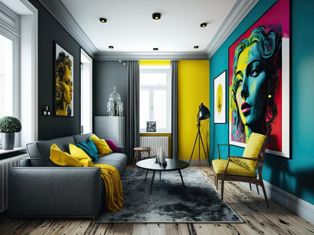
This strategy calls for the use of colors that sit directly opposite each other on the color wheel. When complementary colors are used together in a design, they create a striking contrast, resulting in a dynamic and vibrant aesthetic. The boldness of this scheme can add a sense of drama and excitement to your space. However, it’s important to balance these colors carefully to avoid visual chaos.
- Combination of Harmonious Colors
Here, we explore the concept of analogous colors, which are colors that sit next to each other on the color wheel. These could be warm colors like red, orange, and yellow, or cool colors like blue, green, and purple. By using harmonious colors in your interior design, you can create a soothing and coordinated look. This color scheme is often found in nature and is very pleasing to the eye. It also allows for a lot of variation in shade and tone, giving you plenty of flexibility in your decor choices.
- Serenity in Pastel
Pastel shades are essentially the softer versions of our primary and secondary colors. They’re less saturated, providing a muted, calming effect that’s perfect for creating a peaceful and tranquil environment. Pastels are extremely versatile and can work well with a variety of decor styles, from modern minimalist to rustic chic. They’re also great for small spaces, as they can make a room feel larger and brighter
Tips to Achieve Colour Harmony in Home Decoration
- Understand the Color Wheel: The color wheel is an essential tool for understanding how different colors relate to each other. It’s divided into warm colors (reds, oranges, and yellows) and cool colors (blues, greens, and purples). Learning how to use complementary, analogous, and triadic color schemes from the color wheel can guide you in creating balanced and harmonious home colour ideas.
- Start with a Base Color: Choose a base color that you love and build your color scheme around it. This could be a color that’s already prominent in your space, like the color of your floor or a large piece of furniture, or a color that you want to introduce as the dominant hue.
- Consider the Mood You Want to Create: Different colors evoke different emotions. Warm colors tend to be energizing and uplifting, while cool colors can be calming and soothing. Think about the mood you want to create in each room and choose your colors accordingly.
- Test Your Colors: Before committing, test your colors in the room you plan to use them in. Paint swatches on the wall or bring home fabric or wallpaper samples. Look at them at different times of the day and in different lighting conditions.
- Experiment with Textures and Patterns: Color isn’t just about paint. You can introduce color through fabrics, furniture, rugs, and accessories. Using different textures and patterns can add depth and interest to your space.
Achieving color harmony in home decoration is a blend of science and art. It requires an understanding of the color wheel, careful selection of a base color, and strategic use of color ratios. But it also calls for personal intuition and creativity. The mood you want to create, your personal preferences, and the unique characteristics of your space all play a crucial role.
Neutrals, textures, and patterns provide additional layers of complexity and interest. Ultimately, the goal is to create a space that feels balanced, harmonious, and uniquely yours. With these tips and home décor ideas at your disposal, you’re well-equipped to navigate the colorful journey of home decoration.